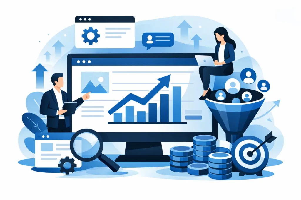
A landing page doesn’t fail because “the design isn’t attractive”. It fails because it asks for too much, explains too little, or distracts the user just when they were ready to take action. If you’re wondering how to create a landing page that converts, the answer isn’t to add more sections, more effects or more text. It’s about reducing friction, increasing clarity and guiding the user towards a single decision.
That’s what many companies overlook. They invest in adverts, SEO or social media to drive traffic to a page that doesn’t quite get the job done. And so the problem isn’t the channel. The problem is that the landing page isn’t designed to convert visitors into leads, bookings or sales.
How to create a landing page that converts without overcomplicating it
The best landing page isn’t the most creative one. It’s the one that makes it clear, within a few seconds, what you’re offering, who it’s for, and what the user should do next. If that isn’t clear right at the top, you’re already behind.
The opening section needs to address three key points. First, a clear value proposition. Second, a reason to trust. Third, a prominent call to action. There’s no need to overcomplicate it. It just needs to work.
A bad headline often sounds generic: “Digital solutions for your business”. A good headline gets straight to the point: “Get more bookings with a landing page designed to turn traffic into customers”. The difference is that one just fills space, whilst the other promises a clear result.
Below the headline, the subheading should clear up any doubts. Here, you can explain in a single sentence how you help and what the user stands to gain. If your service is aimed at local businesses, make that clear. If you save time, simplify the process or take a results-oriented approach, mention that too.
The call to action should be direct. “Request your audit”, “Get a quote”, “Book a call” or “I’d like more information” work better than vague phrases. It’s worth remembering one thing here: the button alone doesn’t convert. It’s the context surrounding it that does.
The structure that usually works best
An effective landing page doesn’t need twenty sections. It needs a logical structure. Visitors arrive with a simple question: “Is this of interest to me or not?”. Your job is to answer that question straight away.
After the main section, it’s a good idea to outline the problem and the solution. Do this in clear language. If you’re selling a service, don’t just describe what you do. Explain how it benefits the client. A clinic isn’t interested in a “multi-channel lead generation strategy”. It wants to receive more appointment requests. A law firm isn’t interested in an “optimised” website. It’s interested in generating qualified leads.
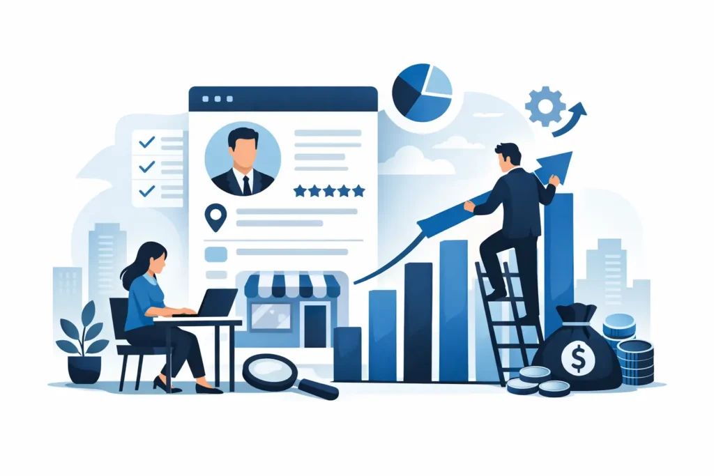
Then comes the proof. This is the crucial point. Many landing pages promise a lot but deliver little. Testimonials, figures, real-life examples, client logos or messages that inspire confidence help to reduce the sense of risk. There’s no need to exaggerate. In fact, the more specific you are, the more credible you’ll be.
You can then highlight the benefits, address any objections and repeat the call to action. That second CTA is no longer aimed at a cold prospect. It’s aimed at someone who has read the content, considered it and is closer to converting.
The message must sell before the design
Here’s a very common mistake: prioritising the visual appearance over the message. Yes, a landing page should look professional. But a visually appealing landing page with a weak message is still a weak landing page.
Copy has to do three things at once: grab attention, keep readers engaged and drive them to take action. That calls for clarity. The more important the conversion, the less room there is for empty phrases.
It’s better to say “We create websites designed to generate real leads” than “We design innovative digital experiences”. The first sentence sells a benefit. The second sounds good, but doesn’t help the reader make a decision.
It’s also a good idea to write in the same way your client speaks. Not the way an agency speaks behind closed doors. If your audience consists of SMEs, local businesses or service providers, use examples that are relevant to their everyday lives. Bookings, phone calls, forms, quotes, appointments. That resonates far more than a speech full of jargon.
What factors really boost conversion rates
There’s no magic formula, but there are certain elements that often make all the difference when they’re done properly.
The first is relevance. If the advert promises one thing and the landing page says something else, you’ll lose conversions. The message conveyed by the incoming traffic must be consistent with the page. Same approach, same intent, same key benefit.
The second factor is trust. Visible contact details, a well-designed layout, genuine testimonials, well-written copy and a clear offer do far more to drive conversions than any animation. If a business looks unprofessional, users won’t take the next step.
The third is simplicity. Every element on the landing page should convey a single message: move forward. If you include full menus, unnecessary links, irrelevant sections or too much technical text, you’ll distract the visitor. And when attention is distracted, conversion rates drop.
The fourth factor is friction. A form with ten fields usually converts less effectively than one with three or four. That said, less isn’t always better. If you need to filter out low-quality leads, you might want to ask for a little more information. There are no hard and fast rules here. It depends on the type of service, the value of the lead and how much you want to prioritise volume over quality.
How to create a landing page that converts according to your objective
Not all landing pages should be built in the same way, because they don’t all serve the same purpose. A landing page for campaigns Google Ads needs to get straight to the point and address a specific objective. A landing page for cold traffic from social media usually requires more context and more social proof. A landing page for remarketing it can be more direct because the user already knows you.
It also varies greatly depending on the type of business. A restaurant or a clinic needs to minimise friction as much as possible and make booking as easy as possible. A high-value service, such as consultancy or web development, usually requires more persuasion and a more strategic approach. In one case, you’re looking for immediacy. In the other, trust and expertise.
That’s why simply copying another company’s landing page rarely works as it is. It can inspire you, yes, but conversion depends on how well the offer, traffic, message and business objective align.
Mistakes that hold back results even when there is traffic
One of the most common mistakes is trying to cram everything in. A landing page isn’t a sales brochure or an “About Us” page. Its purpose is to guide the user towards a specific action. If you try to include all your services, all your benefits and all the finer details, you’ll end up with a page that rambles aimlessly.
Another mistake is hiding the offer. There are websites where you have to scroll down several times just to figure out what’s on sale. That’s a major drawback, especially on mobile. The main offer needs to appear quickly and clearly.
Another major shortcoming is the lack of visual and verbal consistency. Generic headlines, ambiguous buttons, stock images lacking context, and blocks of text that seem to have been thrown together haphazardly. All of this gives the impression of a lack of professionalism. And when you’re asking for contact details, that perception of professionalism carries a lot of weight.
A fourth mistake is failing to measure. If you don’t track conversion rates, clicks on CTAs, scroll depth or lead quality, you’ll be making assumptions rather than informed decisions. A good landing page isn’t perfect from the start. It’s improved through data.
The role of design in a landing page that converts
Design does matter, but as a business tool. It should guide the eye, organise information into a hierarchy and make it easy to take action. It doesn’t need to impress. It needs to help.
White space, good contrast, neatly organised sections and clearly visible buttons usually work better than cluttered pages. On mobile devices, this is even more important. These days, a large proportion of traffic comes from mobile phones, so a slow, clunky or poorly optimised landing page loses conversions before it even gets started.
Images should also convey a clear message. If you can use real photos of your business, your team or your service, all the better. They inspire more confidence than generic stock images. This is particularly noticeable in local and service-based sectors.
What we would do before launching any landing page
Before you publish, it’s worth asking yourself a basic question: can someone who doesn’t know you understand within five seconds what you’re offering and what they should do? If the answer isn’t a clear ‘yes’, you’ll need to make some adjustments.
Next, check the form, the CTA, the loading speed and how well it aligns with the traffic source. And test the landing page on a mobile device as if you were a real customer, not someone who already knows where everything is.
If you want to fine-tune things, create an initial version, drive traffic to it and refine it based on real-world data. Sometimes the change that makes the biggest difference isn’t a complete overhaul of the page. It’s tweaking a headline, moving a social proof element further up the page, or changing the focus of the form.
At AIRIS Agency, we see this all the time: businesses that don’t need more visitors, but rather a better-designed page to convert the ones they already have. Because when the strategy, the message and the structure are all aligned, the landing page stops being just a simple page and starts working like a salesperson who never stops.
The good news is that you don’t need a perfect landing page to get started. You need a landing page that’s clear, focused and designed to make the next step easy. Everything else can be optimised as you go along.