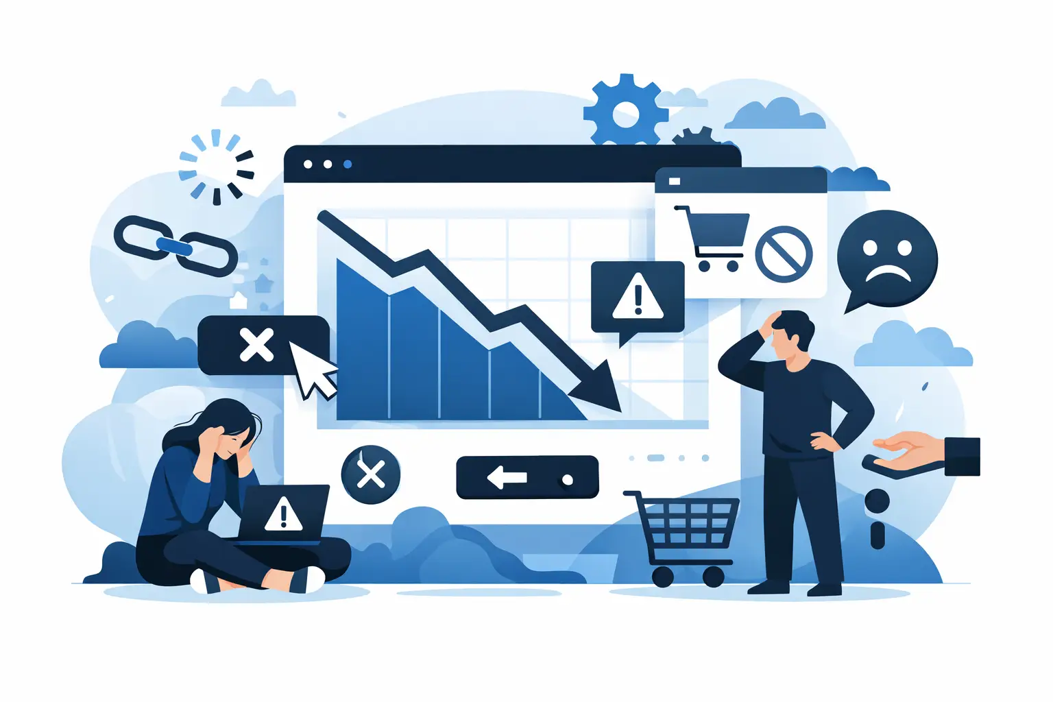
There are websites that receive visits every week and yet generate hardly any leads, bookings or sales. It is not usually a problem of luck. In the majority of cases, there are web errors behind them that lower conversions and are holding back key decisions just when the user was ready to move forward.
The good thing is that it is almost never necessary to redo everything. Often the problem lies in poorly resolved details: an unclear proposal, an eternal form, a slow website or a design that forces the user to think too much. If your business depends on attracting customers online, you should review this as soon as possible.
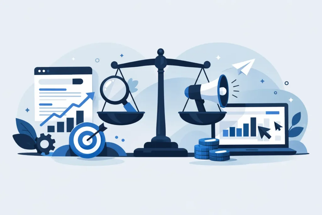
Why these mistakes cost real money
When a website converts poorly, it not only loses out on organic opportunities. It also makes everything else more expensive. Your campaigns Google Ads perform worse, traffic from social media is wasted and SEO takes longer to translate into real business.
This particularly affects local businesses, service companies and brands that need to build trust fast. A user can find you, enter with intent and leave in less than a minute if they don't understand what you do, what you offer or what the next step is.
We are not just talking about aesthetics. We are talking about commercial friction.
Web errors that most frequently lower conversions
1. You don't make it clear what you are doing in the first few seconds.
If someone enters your website and it takes several scrolls to understand what you do, you are already late. The main headline should simply answer three questions: what you offer, for whom and what result that person can expect.
Many websites try to sound sophisticated and end up being confusing. Vague phrases like “we boost your digital presence” say little. On the other hand, a specific result-oriented proposition works better, especially for services. The user doesn't want to decipher your message. They want to know if you are solving their problem.
2. The design is beautiful, but does not guide
A website can look modern and still convert badly. Design should not just look good. It must push the user to action. If buttons get lost, if everything competes for attention or if the visual hierarchy is poorly laid out, the user gets lost.
There is an important nuance here: simplifying does not mean making a flat website. It means deciding what the user should look at first, what they should understand next and where they should click. When this is not thought through, conversion drops even if the branding is impeccable.
3. There are too many different calls to action
This mistake is very common. On the same page they are asked to call, write via WhatsApp, fill in a form, subscribe, download something, book an appointment and continue networking. The result is simple: blocking.
Each page should have one main objective. There can be secondary avenues, yes, but one action should dominate. If you want more leads, design the page for that. If you want bookings, eliminate distractions. The more decisions you force the user to make, the less the user progresses.
4. The website is slow, especially on mobile
Online patience is minimal. If your page takes too long to load, many people won't even see your offer. And we're not just talking about abandoning out of boredom. A slow website conveys carelessness, lowers confidence and gives the feeling that everything will be more complicated than it needs to be.
In local and service businesses this weighs heavily, because much of the traffic comes from mobile. If the menu fails, the images take too long, the buttons move or the form does not respond well, you are losing conversions in the main channel.
A complete rebuild is not always necessary. Sometimes it is enough to optimise images, clean plugins, review scripts or rethink heavy elements. But you have to look at it with technical criteria and with a business focus.
Web errors that lower conversions on service websites
5. You do not generate enough trust
Asking for a contact is asking for a small commitment. Asking for a reservation or a purchase is asking for even more. If the website does not transmit credibility, the user postpones the decision or goes to the competition.
Trust is built with concrete signs: real testimonials, success stories, reviews, professional photographs, well-written texts, visible contact information and a coherent proposal. Something more basic than it seems is also important: that everything looks up-to-date and well cared for.
A website with generic messages, implausible stock images and inflated promises often generates the opposite effect to the desired one. In competitive industries, trust is not assumed. It is demonstrated.
6. The form asks too much
The more fields you add, the more the conversion rate drops. This does not mean that you should always ask only for name and phone number. It depends on the type of service, the average ticket and the quality of lead you need. But many websites ask for too much information too soon.
If the user is just getting to know you, asking for extensive data generates friction. Better a simple first contact and, afterwards, there will be time to qualify. In some cases it is even better to offer alternatives, such as click-to-call or direct contact by messaging, if they fit in with your business process.
7. You write with your company in mind, not the customer.
This failure goes unnoticed because it seems normal. The website talks about the company, its experience, its methodology and its services, but it does not connect this with the real problem of the client. The visitor does not enter to admire your internal structure. They come in to solve something.
The text must translate your capabilities into concrete benefits. It is not enough to say that you do diseño web, SEO or advertising. Explain what changes for the business: more visibility, more qualified contacts, more bookings, less dependence on word of mouth.
When the message focuses too much on “us” and not enough on “what's in it for you”, conversions suffer.
8. You do not resolve objections before contact
Many users do not convert because they are missing a piece of information. They don't know if you work in their area, how long the service takes, if there is permanence, if the budget is tailor-made or if you fit in with businesses like theirs. If these doubts are not resolved, people don't ask. They leave.
There is no need to fill the web with text. It is necessary to anticipate what is holding back the decision. A good commercial page reduces uncertainty. It explains the process, sets realistic expectations and removes barriers before they appear.
It is a key difference between a showcase website and a website designed to sell.
9. You don't measure what's going on
This is one of the most expensive mistakes because it prevents you from correcting the others. If you don't know which pages attract visits, where users drop off, which forms convert or which channel brings the best leads, you are making blind decisions.
It's not about obsessing over empty metrics. It is about having visibility on the commercial journey of the website. What enters, what is interesting, what is abandoned and what generates real business. Only then can you improve with judgement and not by intuition.
How to detect quickly if your website is losing conversions
There are very clear signals. You get traffic, but hardly any contacts. You get unqualified people writing to you. Campaigns generate clicks, but no real opportunities. The sales team says that the website does not filter well. Or you notice that many users call directly to ask questions that should be very clear on the website.
Another common clue is when the business works well on recommendation, but the website does not match that level of trust. In that case, the problem is not the offer. It is how it is presented and how the action is facilitated.
A serious audit usually detects in a short time whether the brake is in the message, in the structure, in the speed, in the mobile experience or in several points at once. And yes, sometimes there is more than one overlapping problem.
What to prioritise first
If your website converts poorly, don't try to fix twenty things at once. Start with what usually has the most impact: clarity of the main message, call to action, visible trust and mobile experience. Then review forms, page structure and measurement.
Here it is important to be honest. Not everything can be solved with small tweaks. There are websites that can be progressively optimised and others that were born wrong. The decision depends on the current status, the volume of traffic and the commercial objective. The important thing is not to keep investing in attracting visitors to a site that is not ready to convert them.
At AIRIS Agency we see it often: businesses with good service, good reputation and real potential, but with a website that is not helping to sell. When that is corrected, it not only improves conversion. It also improves the performance of all the marketing around it.
If your website receives attention but does not generate the volume of leads it should, don't assume that “the internet is difficult”. Often the problem is much more concrete, and also much more solvable, than it seems. Reviewing these points can be the difference between having a website that looks good and a website that works for your business.