If your website gets visitors but doesn’t generate calls, form submissions or bookings, the problem isn’t usually the traffic. It’s usually the conversion rate. That’s why, when a business asks itself how to improve web conversion, the answer is almost never “make a prettier website”, but rather to build a site that helps users make quick, confident decisions without any friction.
In the service sector, conversion isn’t just down to design. It depends on the visitor understanding within a few seconds what you do, who you do it for, and why they should contact you rather than another company. If that message isn’t clear, the user will hesitate. And when they hesitate, they’ll leave.
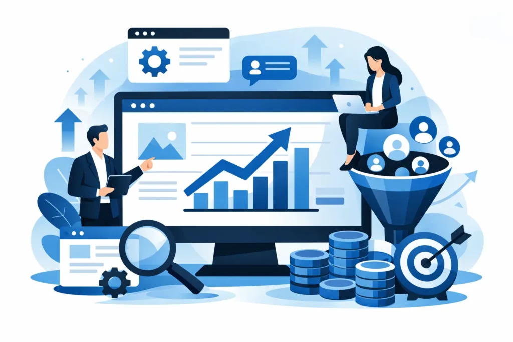
How to improve web service conversion rates through the value proposition
Most service websites get the first point wrong: they talk about the company, but not about the customer. They open with generic phrases, empty promises or text that could apply to any business in the sector. The result is predictable: little attention, little interest and even fewer enquiries.
A useful value proposition should answer three very simple questions: what problem do you solve, for whom, and with what outcome? There’s no need to overcomplicate it. In fact, the clearer, the better.
It’s not the same to say “comprehensive marketing solutions” as it is to say “we help you get more bookings and more customers without the hassle of digital management”. The second sentence addresses a real need. The first sounds fine, but it doesn’t inspire anyone.
There’s an important point to bear in mind here. If you offer a range of services, don’t try to sell them all at once on the first screen. The user doesn’t need to know your entire structure. They need to quickly understand whether you can solve their problem. There will be time later to explain processes, specialisms or complementary services.
Less friction, more connections
A service website converts better when it makes it easier for users to take the next step. It seems obvious, but many websites ask too much of the user: long forms, confusing menus, dense text, buttons that are hard to spot, or calls to action that don’t say anything.
If you want to generate leads, every extra step works against you. Asking for a name, phone number, email address, company name, budget, sector, message and various other details might seem useful for filtering. In practice, however, it also reduces conversions. Sometimes it’s better to qualify leads later on, rather than at the first point of contact.
The button is also more important than it seems. “Send” is cold and passive. “I’d like more information”, “Request a quote” or “Book a call” make it much clearer what’s going to happen. And that reduces uncertainty.
It’s also not a good idea to clutter the page with too many different options. If, within the same section, you encourage visitors to call, message via WhatsApp, download something, view the portfolio, follow you on social media and read the blog, you’ll end up distracting them. On a service-oriented website, each page should have a single main objective. Everything else should support that objective, not compete with it.
The form isn't just a formality; it's a sale
Many businesses treat the form as a technical element at the bottom of the page. Wrong. The form is part of the sales pitch. If it appears out of context, without a clear promise and without conveying ease of use, it converts fewer customers.
It works best when accompanied by a phrase that highlights the benefit and lowers the barrier. Something as simple as explaining that you’ll reply soon or that the initial consultation is no-obligation can make all the difference. There’s no need to push. What’s needed is to put people at ease.
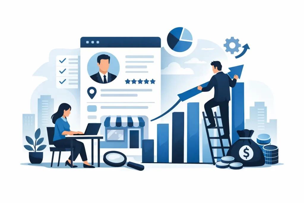
Visible trust or a silent leak
When someone hires a service, they’re not just buying a solution. They’re buying peace of mind. They want to feel that they’re in good hands, that they won’t waste time, and that the company knows what it’s doing. If your website doesn’t convey that, you’re missing out on opportunities, even if you have plenty of traffic.
Trust is built through concrete evidence. Genuine reviews, success stories, data, your own photos, a visible team, client testimonials or clear explanations of the process. Anything that reduces the sense of risk helps.
In local services or those with an average ticket price, this is even more important. A business in Marbella, Mijas or Fuengirola doesn’t want empty platitudes. It wants proof that you understand its context, its market and the type of customer it’s looking to attract. Genuine local connection is what wins customers over.
There’s a common mistake: posting generic testimonials that say nothing. Phrases like “very professional” or “great service” don’t add much. On the other hand, a testimonial that mentions the initial problem, the experience of working with you, and the result achieved has a much greater impact. The same applies to success stories. It’s better to have one well-explained one than ten superficial ones.
Design to support sales
You don’t need a flashy website to get more conversions. You need a clear structure. Good design on a services website isn’t about showing off. It’s about guiding visitors.
This means visual hierarchy, clean layouts, scannable text and a layout designed to allow the user to navigate effortlessly. If everything is competing for attention, nothing stands out. If everything is organised, the message stands out and is easier to understand.
The first section of the page is crucial. It should include a clear promise, a brief explanation and a clear call to action. The rest of the content must address objections in the correct order: what you do, how you work, why you should be trusted, what results you can deliver, and how to get in touch.
Mobile is king here. In many service-based businesses, the majority of traffic comes from smartphones. If the mobile experience is slow, cumbersome or confusing, conversion rates drop. Small buttons, endless text or forms that are difficult to complete on a small screen come at a direct cost.
Speed and clarity: two invisible selling points
Page load speed isn’t just a technical issue. It’s part of the shopping experience. If a page takes too long to load, users will lose patience before they’ve even had a chance to consider your offer. The same goes for clunky navigation.
There’s no need to get hung up on individual metrics, but it is important to understand the real impact. A fast, clear website keeps visitors on the site longer, builds trust and makes it easier for them to get in touch. A slow website forces users to make an effort. And nobody wants to go to the trouble of requesting a quote.
How to improve website conversion rates with content that answers questions
A service website shouldn’t just describe what you sell. It needs to help people make a decision. That means anticipating questions and addressing objections before the user even raises them.
How long does it take? Do you work with businesses like mine? What does the service include? What results can I expect? What is the process like? Is there a minimum contract period? Who will be looking after me? When these answers aren’t provided, visitors fill in the blanks with scepticism.
That doesn’t mean turning the page into a never-ending wall of text. It means writing with purpose. Each section should address a specific concern. If you get it right, the website acts like a sales representative who doesn’t push, but does offer guidance.
It is also important to tailor the message to the actual intent of the traffic. A landing page for Google Ads campaigns than a service page designed for SEO. Users arriving via an advert usually want to get straight to the point. Users coming from search engines may need more context before getting in touch. Conversion rates improve when the content meets those expectations.
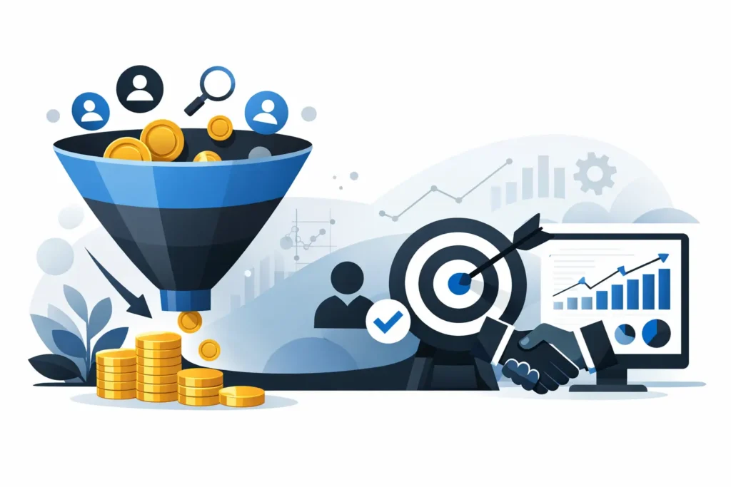
Measure accurately to stop guessing
Many businesses change colours, text or buttons without knowing what’s going wrong. That’s not optimisation. It’s trial and error.
If you want to improve your results, you need to look at the whole picture. How many visitors you get, where they come from, which pages receive the most traffic, where users drop off, and which forms or calls to action generate actual leads. Not all channels convert at the same rate, nor are all leads of the same quality.
Sometimes the problem isn't with the homepage, but with a landing with a weak promise. Or a campaign that attracts low-quality traffic. Or a form that generates leads, but with low purchase intent. Improving conversion isn’t just about increasing the percentage. It’s about generating better sales opportunities.
That’s why it’s best to make changes judiciously and prioritise what can make the biggest difference first. Typically, the greatest impact comes from five areas: value proposition, call to action, trust signals, page structure and speed. Tweaking visual details can help, but it rarely pays off if the fundamentals are still weak.
You don’t need any more visitors if the landing page isn’t converting
There are companies that invest more in SEO, adverts or social media when your website isn’t yet ready to convert visitors. That only makes the problem worse. More traffic to a poorly designed page doesn’t mean more business. It means more lost opportunities.
The sensible approach is to align lead generation with conversion. First, a clear, fast and compelling website. Then, targeted traffic. When these two elements come together, every euro invested delivers a better return. And that shows in what really matters: more valuable leads, more meetings and more sales.
At AIRIS Agency, we see this pattern time and time again in service-based businesses: there’s no need to overcomplicate things; what’s needed is to sort out what should already be working. Sometimes a change to the core message, a better-thought-out structure and a clearer proposition are worth more than a complete overhaul.
If your website isn’t converting as well as it should, don’t assume that the market isn’t responding. Often, the problem isn’t a lack of demand. It’s how you present your service and how easy you make it for customers to take the next step. That’s where the real results start.