There are websites that look nice in a meeting and websites that fill the agenda. The difference is not usually in the colour of the button or in an extra animation. It is in whether the web design to generate customers has been conceived as a commercial tool or as a simple showcase.
For an SME, local business or service company, the website should not exist just to “be there”. It should help to get calls, forms, bookings, requests for quotations or visits to the premises. If that doesn't happen, the problem is not a lack of traffic. Often the problem is that the website is not built to convert.
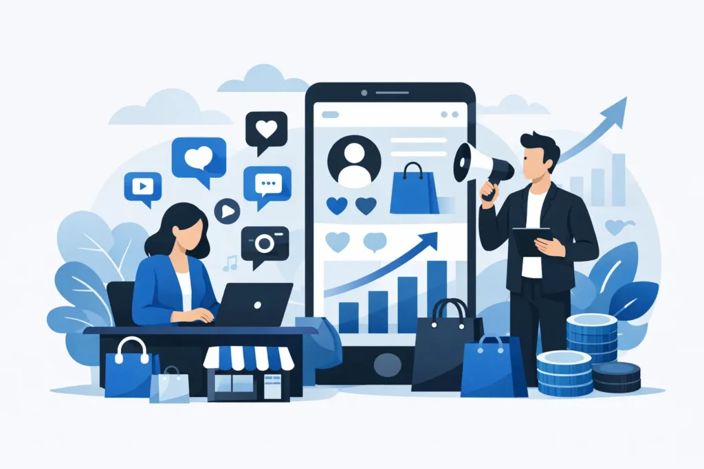
What web design means to generate customers
It means designing with a clear business objective. You don't start with “what style do we like”, but with “what action do we want the user to take” and “what do they need to make up their mind”. That difference completely changes the approach.
A recruitment-oriented website guides the visitor logically. It makes it clear what you do, for whom, why they should trust you and what the next step is. All this has to happen quickly. If a person comes in and in five seconds doesn't understand if you can help them, they leave.
Here's a reality that many businesses are late to discover: having a modern website does not guarantee results. You can invest in a visually impeccable design and still miss opportunities if the message is confusing, the navigation is distracting or the form looks like a bureaucratic trap.
The web does not sell alone, but it can facilitate sales.
It should be stated bluntly. A website does not replace a good offer, nor does it fix a weak service, nor does it compensate for an out-of-market price. But it can multiply the commercial performance of a business that already has a solid proposition.
Let's think of an office, a clinic, a real estate agency, a restaurant or a renovation company. In all these cases, the user arrives with a specific need and little time. They don't want to do too much research. They want clear signs of trust, a simple explanation and an easy way to contact.
That is why the design must work in the service of the decision. Each section has to answer a real question: what you offer, how you work, how long it takes, where you are, what results you have achieved and why choose you over another option nearby.
Key elements of web design to generate customers
The first thing is clarity of message. The header of the website has to say what you do and who you do it for. Not with empty phrases, but with a concrete proposal. If a user lands on a homepage and only sees generic slogans, they will not connect.
The second thing is the visual hierarchy. A good website does not show everything at once. Prioritise. Highlight the main service, place visible calls to action and make the user's journey natural. When everything competes for attention, nothing wins.
Trust is also very important. Testimonials, real cases, locations, professional photos of the team or the business, seals, years of experience or transparently explained processes help to reduce friction. In local and service businesses, this weighs heavily. The customer doesn't just buy a solution. They buy peace of mind.
Speed is another decisive factor. A slow website loses opportunities before it even starts. It not only affects the user, but also the positioning. And if the traffic comes from Google Ads campaigns or social networks, every second of charge can be costly.
Finally, there is the practical conversion. Simple forms, well-placed buttons, mobile direct call option, WhatsApp if it makes sense in the business process, and action-oriented messages. Asking for too much data too soon tends to lower the number of contacts.
What often goes wrong with many company websites
The most common mistake is to design with the company in mind and not the customer. Pages are filled with corporate history, abstract texts and services explained from the inside, as if the user already knew the sector. But most of them do not arrive with patience. They arrive with doubts.
Another common mistake is to mix too many objectives. The same page tries to sell all the services, tell the whole story, rank for all the keywords and also be original. The result is a scattered page that does not push any concrete action.
We also see visually cluttered websites. Heavy videos, unnecessary effects, complex menus and distracting blocks. Design has to add, not complicate. If the visitor needs to think too much to move around, they will end up looking for a simpler option.
And then there is the classic “contact us” problem lost at the end. If generating customers is the goal, contact cannot be an afterthought. It must be strategically present throughout the experience.
Design, SEO and advertising: when they work together
A website can be attractive and still not receive visits. Or it can receive visits and not convert. That is why design should not be considered in isolation from SEO and advertising.
If a company wants to capture local searches, for example in Marbella, Fuengirola or Mijas, the site must be prepared to position services with real purchase intent. This affects the structure, the content, the service pages and how the information is organised.
If you also invest in campaigns, the website has to be ready to convert that traffic. It is not enough to send ads to a generic homepage and wait for results. Many times a well thought-out landing page works better than a corporate website full of distractions.
This is where a strategic approach makes a difference. Design ceases to be an isolated piece and becomes part of an engagement system. That system combines message, traffic, trust and conversion.
What does an SME need for its website to generate real opportunities?
A huge website is not always necessary. In many cases, a clear structure with a few well-designed pages gives better results than a large, cluttered site. It all depends on the type of business, the sales cycle, and the main source of acquisition.
A service company with a high average ticket may need service-specific pages, case studies and segmented forms. A local business may need a more direct, call-oriented website, maps, reviews and bookings. A personal brand may rely more on authority, content and a very clear proposition.
The important thing is not to copy other people's structures without criteria. What works for an ecommerce does not work for a clinic. What converts in a Meta Ads campaign does not always coincide with what works best for a clinic. SEO positioning. Decisions need to be made in context.
How to know if your website is losing customers
The signs are quite clear. You get visitors but hardly any forms. People are in and out fast. Paid traffic doesn't convert. You are contacted by unqualified people. Or you end up closing more sales through recommendations than through the website, even though you have been investing in it for a long time.
Another clue is when the sales team always has to explain the same thing because the website does not solve basic doubts. If a website forces them to do too much pedagogy before a call, they are probably not filtering or preparing the lead well.
A good website does not eliminate commercial work, but it does improve it. It makes the contact more informed, more confident and closer to making a decision.
Designing to capture, measure and improve
A website that generates customers does not end the day it is published. From there begins an equally important phase: measuring what works and adjusting. Which pages attract the most contacts, which forms convert best, from which device users arrive, where they abandon and which messages generate the most response.
This analysis allows us to improve without improvising. Sometimes the change that has the greatest impact is not to redo the entire website, but to refine the main headline, simplify a landing page or reduce the number of steps in the contact. Other times a more in-depth revision is necessary because the base is poorly planned.
At AIRIS Agency we work according to this logic: less frills, more focus on results. Because you may like a beautiful website, but a well thought out website has to please the market and, above all, convert.
If your website doesn't help you sell today, you don't need to make it more complicated. You need a clear structure, a convincing message and a design designed so that every visit has a useful outcome. That's where a website stops being an expense and starts to function as what it should be: a real tool for growth.